


Flyers & promotional print
Printed promotional material for offers, launches, campaigns, events and other customer-facing business communication.
Typical use:
promotions, events, sales campaigns and local marketing
From marketing material and business stationery to promotional print and everyday operational requirements, DSP helps businesses turn artwork into professionally produced printed material. In-house design and production support can also help prepare files, layouts and specifications before printing begins.
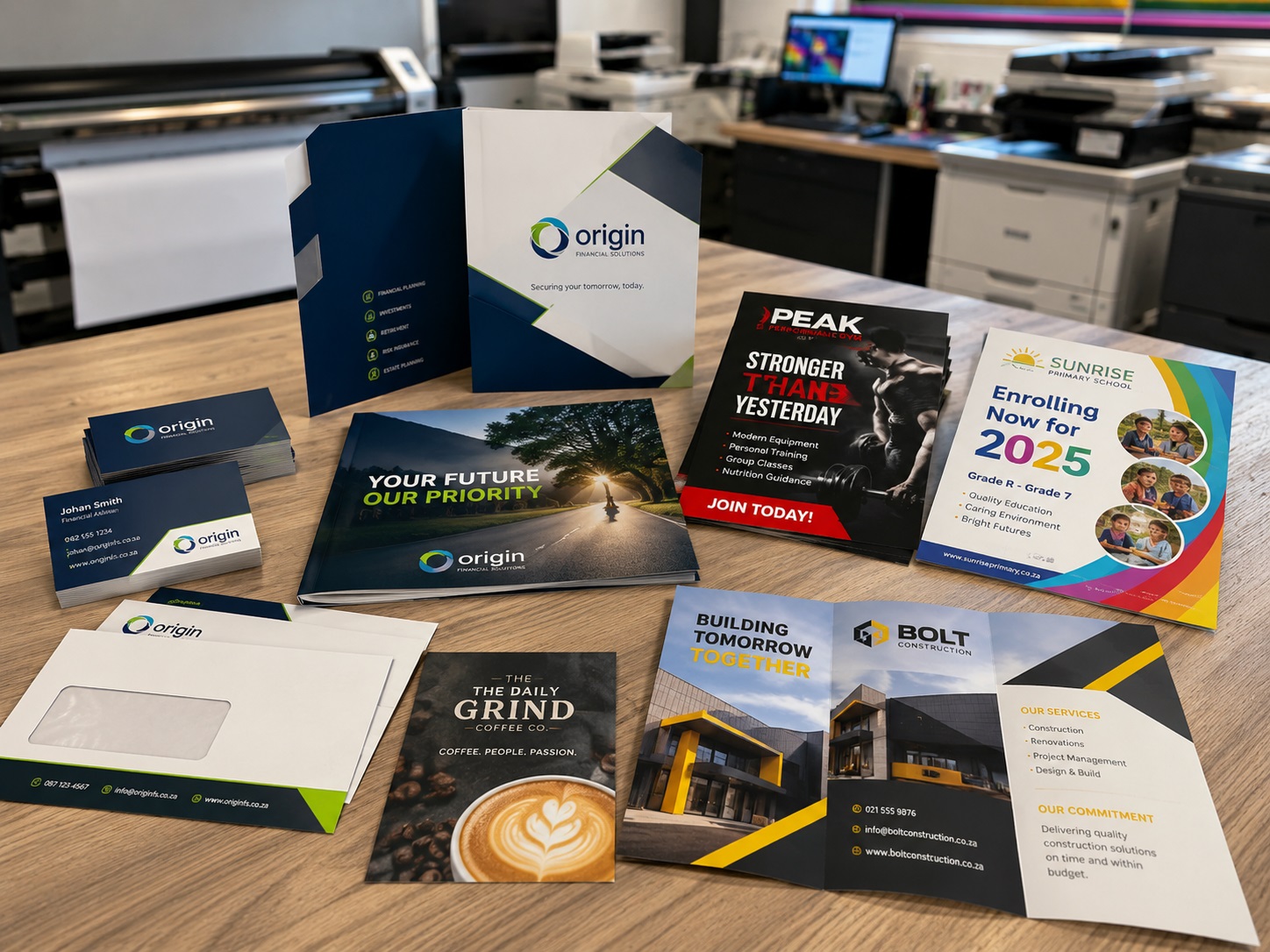
Full colour printing supports a wide range of day-to-day business requirements. DSP can help with the artwork, quantities, format and finishing needed to turn the requirement into a practical finished print product.
Printed promotional material for offers, launches, campaigns, events and other customer-facing business communication.
Professionally printed material for presenting products, services, company information and other business content in a physical format.
Printed business material that helps maintain a consistent and professional presentation across day-to-day company communication.
Printed material for meetings, presentations, training, information packs and other business communication where physical copies are required.
Coordinated printed material for activations, campaigns, launches and events where several printed pieces may need to work together.
Not every requirement fits neatly into a standard product category. DSP can assess the size, quantity, artwork and intended use to help determine a practical production route.
Not sure exactly what to specify? Send DSP the item you need, approximate quantity, finished size, required timing and any artwork you already have. The team can help work through the remaining print and production details.
Discuss Your Print Job ↗You do not need to arrive with a fully specified print order. DSP can help clarify the format, artwork and finishing requirements, but the information below gives the team a useful starting point.
Send the artwork you already have, including logos, layouts or reference material. DSP can assess whether the file is ready for production or needs adjustment.
The required dimensions affect the layout and production setup, so it helps to confirm the intended finished size before printing begins.
Share the approximate number of items required. Quantity is an important part of assessing the most practical way to produce the job.
The final use can influence the print format and material choice. DSP can help work through these options if they have not yet been decided.
Folding, trimming and other finishing requirements should be considered as part of the final printed item rather than as an afterthought.
Share the date the print is needed, especially where the material supports a campaign, event, meeting or other fixed business deadline.
Do not have production-ready artwork yet? DSP's in-house design team can help prepare or adapt existing material with the intended print size, layout and finished application in mind.
Explore Design Support ↗These examples illustrate how different print formats can support everyday business communication, production requirements and campaign activity. DSP can help determine the appropriate format, quantity and finishing for the intended use.
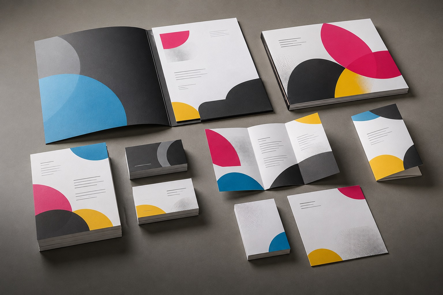
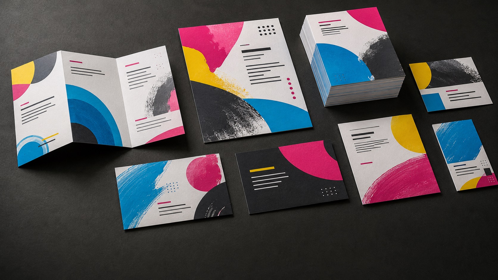
Full colour printing is often part of a wider business requirement. DSP can also support document production, larger print runs, artwork preparation and printed labels through related in-house services.
Practical document printing, copying and related production support for day-to-day business, office and presentation requirements.
Explore Copy Centre ↗ Print productionAn additional print production route for suitable business and commercial print requirements where the job specification calls for a different production approach.
Explore Litho Printing ↗ Artwork supportArtwork preparation and layout support for brochures, flyers, stationery and other printed business communication.
Explore Design Support ↗ Business essentialsPrinted labels for business, product, operational and other practical applications where clear identification or branded information is required.
Explore Label Printing ↗The finished size, quantity, intended use and available artwork are usually enough to start the conversation. DSP can help clarify the remaining print and production details.
Include the type of printed item you need, approximate finished size, quantity, required timing and any artwork you already have. If the material, finishing or exact specification is still undecided, DSP can help work through those details.
Yes. DSP provides in-house design and artwork support. Existing files can be checked or adapted for production, and layouts can be prepared where further design work is needed before printing.
The most practical production route depends on the finished size, quantity, intended use, material and finishing requirements. You do not need to select the production method yourself before making contact — DSP can help assess the requirement.
Yes. Where a campaign, event or ongoing business requirement involves several printed items, DSP can assess the artwork, quantities and production requirements together so the different pieces work as part of the same project.
Not sure what to specify? Send DSP the requirement, quantity, artwork and deadline you already know. The team can help clarify the rest.
Contact DSP →Send DSP the item you need, approximate finished size, quantity, required timing and any artwork you already have. The team can help clarify the remaining artwork and production details before the job moves into print.